Notes on Piazza Del Campo
One destination that topped my Travel bucket list was Siena, an Italian city. Studying it in architecture history was not just enough for me, I wanted to observe and learn about its urban qualities through sketching and personal experience.
Join me on this interesting journey as we explore the Italian city of Siena and its iconic Piazza del Campo through careful observation and a sense of wonder. This blog post will combine my firsthand experiences with research to address questions that emerged during my visit.
Disclaimer: This blog post is intended solely for the purpose of exploring and documenting my ideas and observations. References and links will be provided at the end of the post.
Gothic Details of Torre del Mangia and Palazzo Pubblico
Siena, A Medieval City
Siena is renowned as one of the best-preserved medieval cities, with minimal alterations from its original form, as noted by UNESCO World Heritage. After the overthrow of the government of Bishops, Siena became a city-state, navigating its path alongside Florence and the Medici family. From 1287 to 1355, it was governed by the Noveschi, during which the city experienced great prosperity. In Siena, the first known banking system was established and considered to be home to the oldest bank in the world (Banca Monte dei Paschi di Siena).
Notable architectural achievements from this period include the Cathedral of Siena (Duomo di Siena), Palazzo Pubblico, city walls, and water supply systems. Among its many treasures, Siena's famous square, Town Hall Piazza del Campo, stands as a prime example of a public square or Piazza. But what sets this square apart and makes it so exceptional?
Journey to Siena
The trip to Siena was a one-day excursion from Florence, where I stayed for a week. After a one-hour train ride from Florence, I arrived in Siena with great curiosity to see how it looks, and one thing that came to mind was Piazza del Campo.
I arrived at the central station and then went to a mall in front of the station. Taking elevators for more than 10 minutes seemed unusual, but I realized it was because of the city's elevation. They make it easier for visitors to reach a place where they can walk.
I took my first stroll around the city to explore the hills and admire the beautiful structure of the city from a distance. The city is one of the hilly towns in the Tuscan province of Italy. I must admit that nothing compares to the beauty of these views, with the city rising and blending into the landscape without any modern or egoistic post-modern interventions.
Journey to Piazza Del Campo
My way toward Piazza del Campo - an esteemed UNESCO World Heritage site and one of Europe's most significant squares - was through the city’s narrow streets and its homogenous urban fabric. Despite the high temperature surpassing 40 degrees, the stroll proved enjoyable.
The closely spaced buildings formed narrow streets, providing enough shade and shielding from the sun's direct heat while allowing a refreshing breeze. Furthermore, the intentional alignment of the buildings was a result of the proactive efforts by the Noveschi commune governance to preserve the city's urban aesthetics.
The government held a monopoly on brick production and enforced regulations concerning building heights and street widths, resulting in remarkable consistency and timeless quality throughout the city.
Exploration and observations
APPROACH
Consulting Google Maps, I realized I was nearing my long-awaited destination. Walking through the organic streets adapted to the hilly terrain, I noticed a staircase leading down to the piazza, which seemed a bit strange. I was expecting a direct vista to the square between the buildings, one can simply walk by without noticing that the piazza could be accessed from here.
The reason behind it is because The closed facade design surrounding the piazza contributes to the cohesive and unified appearance of the square. The buildings, with their consistent height and architectural style as mentioned before, create a harmonious and visually pleasing ensemble. Thus, opening in Del Campo’s surrounding urban fabric was very limited.
Sketch of interruption in Urban fabric and structures of Piazza Del Campo
Piazza Del Campo
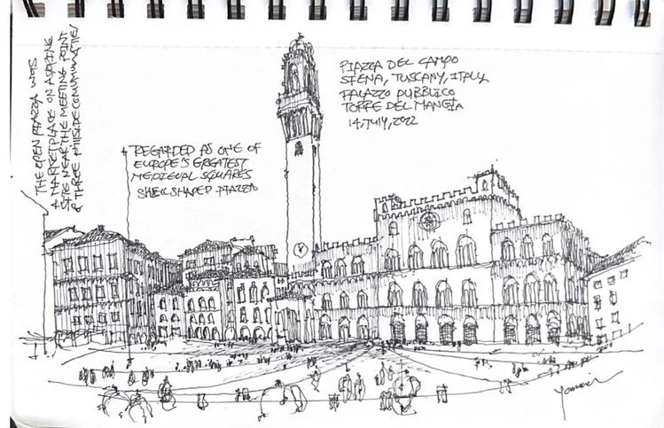
As I descended a couple of stairs from a higher level to a lower level, the Mangia Tower revealed itself, standing tall. while approaching the Piazza, it was breathtaking. It wasn't too vast or too narrow; it felt just right. Standing at the edge of the piazza, it was evident that I was on a higher level than the lower point. The piazza formed a shell shape or a fan shape, divided into eight areas by contour lines. The question here is why Piazza Del Campo took this shape and this difference in height.
First view of Piazza del Campo with the magnificent height of Torre del Mangia
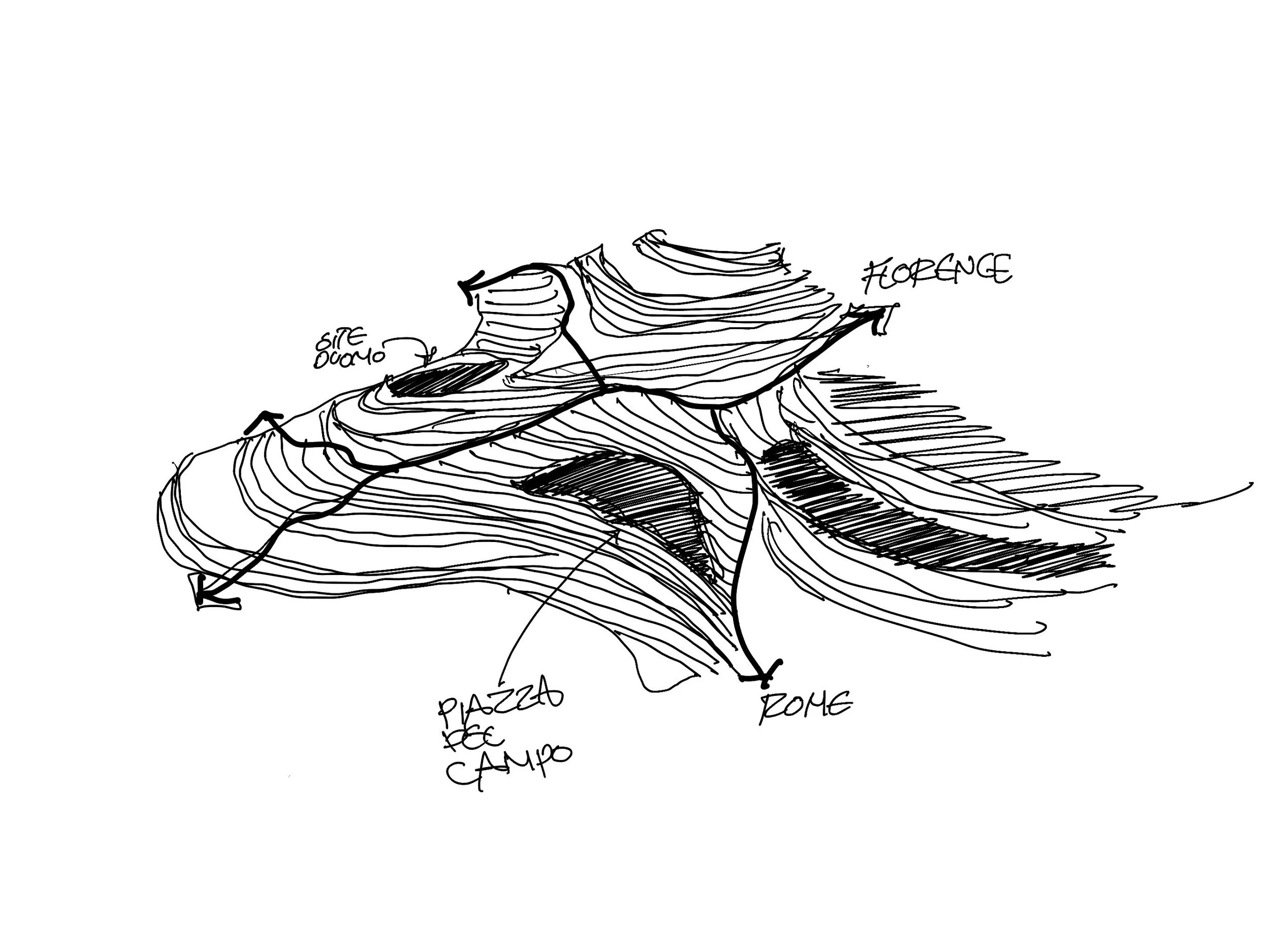
This dates back to the original piazza formation, dating back to the 12th century when it served as a marketplace outside the city walls. The square's unique fan shape is believed to have evolved gradually, influenced by the hilly terrain and the three surrounding hills. The first and highest hill, Castellare, houses the Cathedral and Bishop's palace, while the second hill, San Martino, points towards Florence, and the third hill, Camollia, descends in the direction of Rome.
View of Piazza Del Campo from Torre del Mangia
The central area between the three hills is relatively flat and naturally formed Piazza del Campo, a central place of governance and trade with nine rays radiating from the center, represented by the Palazzo Pubblico. These divisions correspond to the ruling parties that once ruled the city -the regime of the ‘Nine Governors and Defenders of the Commune and People of Siena’ who ruled from 1285- and are still celebrated today during The Palio. check out here for more information about Siena and the rule of the Nine.
A set of curved buildings surrounds the natural topography of the hill, creating a focal point at the center of the square.
Sketch of Siena hills and its relationship to the central Piazza Del Campo
Torre del Mangia and Palazzo Pubblico
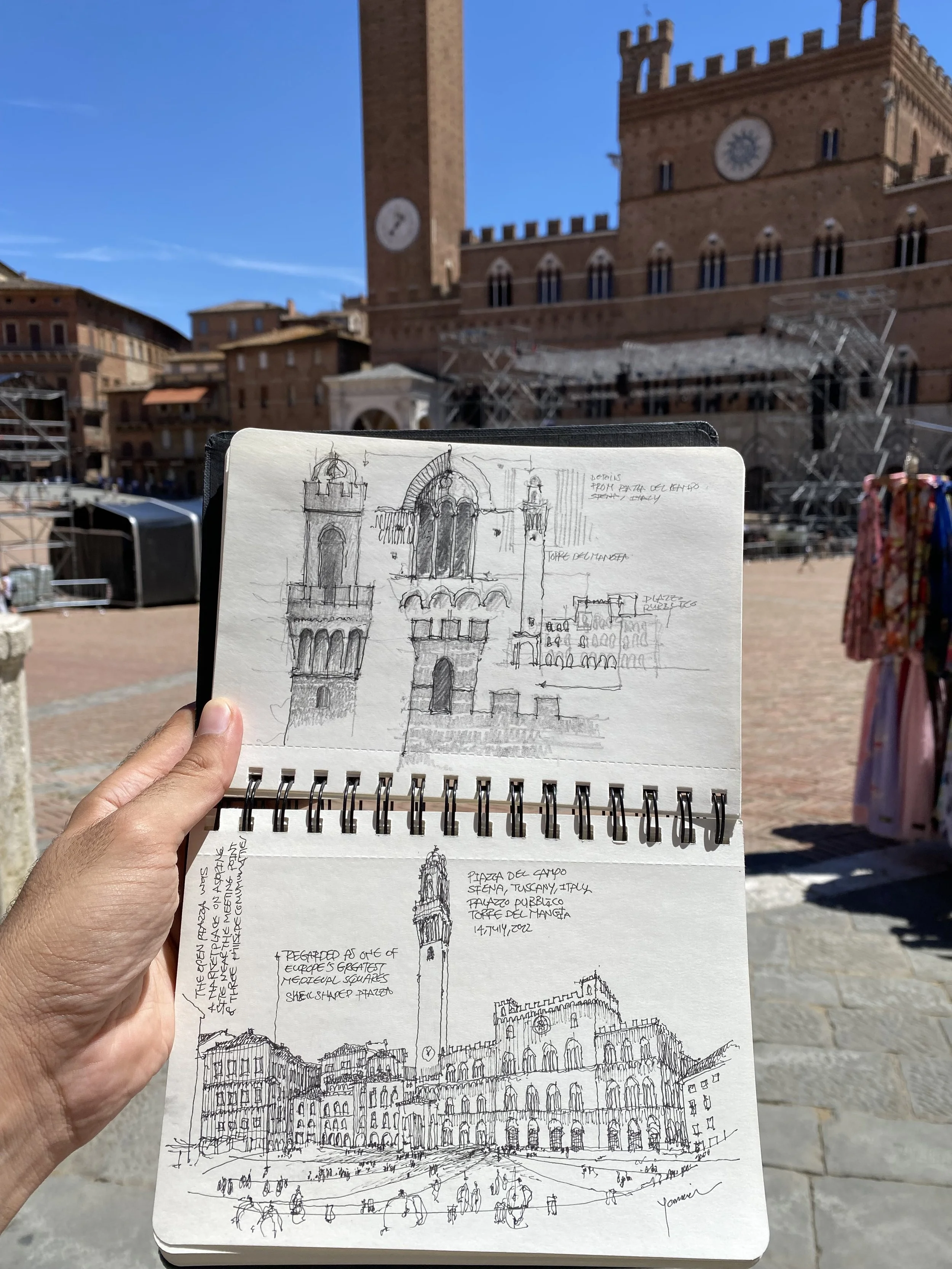
Let's explore Palazzo Pubblico, which is the city hall of Siena, built in the late 13th and early 14th centuries. The palace's design is attributed to several architects, including Domenico di Feo, Giovanni di Agostino, and others. Its facade facing the square showcases Gothic elements and distinctive windows.
Adjacent to the Palazzo Pubblico stands the Torre del Mangia, a tall bell tower built between 1325 and 1348, designed by architects Muccio and Francesco di Rinaldo. During my walk around the piazza, I noticed that the Torre del Mangia appeared quite tall compared to the surrounding buildings. I also observed a subtle change in angle when viewing the Palazzo Pubblico up close, which, as depicted in the picture, wasn't particularly noticeable.
One of the surprising things I discovered was the reason behind the Torre del Mangia's height. It has to do with the relationship between the Cathedral, Duomo di Siena, representing religious authority, and the Palazzo Pubblico, symbolizing civic authority. The Torre del Mangia was constructed three decades after the Palazzo Pubblico, yet it stands higher than the Cathedral, despite being built from a lower point.
As part of the Palazzo Pubblico, the Torre del Mangia symbolizes the civic and political power of the Republic of Siena. It served as a prominent landmark, visually representing the city's government and its influence. The tower's height and grandeur conveyed the authority and prestige of the ruling authorities.
Sketch from Form and Content: The Analysis of an Urban Setting, explaining the height relationship between Torre del Mangia and Duomo di Siena
On the other hand, the Siena Cathedral, also known as the Duomo di Siena, represents the religious and spiritual authority of the Catholic Church. As a magnificent cathedral, it stands as a testament to the devotion, faith, and religious traditions of the people of Siena. The cathedral served as the seat of the Bishop of Siena and held great significance as a religious center.
The proximity of the Torre del Mangia and the Siena Cathedral in the Piazza del Campo highlights the connection and interplay between secular and religious power within the city. Their juxtaposition reflects the historical relationship between civic governance and religious authority, which were both influential forces in the life and identity of Siena.
The slight tilt in the facade of Palazzo Pubblico is an adaptation to the curved shape of the piazza. Though not immediately noticeable, it showcases the intricate details of how the architecture was adjusted to suit the unique layout of the square.
Correlation to Duomo
I started sketching the piazza while sitting at one of the beautiful cafes around it. After finishing my sketch, I decided to explore other areas, including the cathedral, Duomo di Siena.
As I took a different pathway in the corner opposite the Palazzo Pubblico, I noticed a crowd of people gathered there. Curious, I walked in that direction, and when I turned back to look, I saw the perfect view of the piazza. Everything now made sense.
The tall tower had its specific reasons, which contributed to the decision. I stopped there, appreciating the beautiful view while having some ice cream from a gelato shop on the same corner.
This was also a very interesting correlation, as mentioned before, the Piazza's urban facade was mostly closed with limited openings in the urban mass, which is why a very significant opening to the piazza is directed towards the way to the cathedral.
In an urban analysis conducted by David Walters, titled "Form and Content: The Analysis of an Urban Setting," certain connections were observed between the buildings, urban spaces, and the activities and values of the citizens. The study highlighted the main axis of the curved set of buildings oriented towards the center, with another oblique axis articulated by the tower, making a bold statement of civic power.
Correlation between center of curved wall and axial orientation of the major interruption
The study noted, "The major break in the enclosing curve of buildings relates closely to the adjacent street pattern and the main pedestrian route to the Cathedral. This main entry point provides direct views of the Palazzo Publico."
Consequently, most of the other entrances to the Piazza were concealed to emphasize the importance of the major breakthrough in the surrounding buildings and the Piazza's major structures.
Duomo di Siena
Continuing my journey to the cathedral, I encountered steep slopes with breathtaking views nestled between the buildings. The beauty of the surroundings made the journey long enough to capture pictures. Finally, when I reached a flat area, I walked down a wider street, which opened up to reveal the vista of the cathedral.
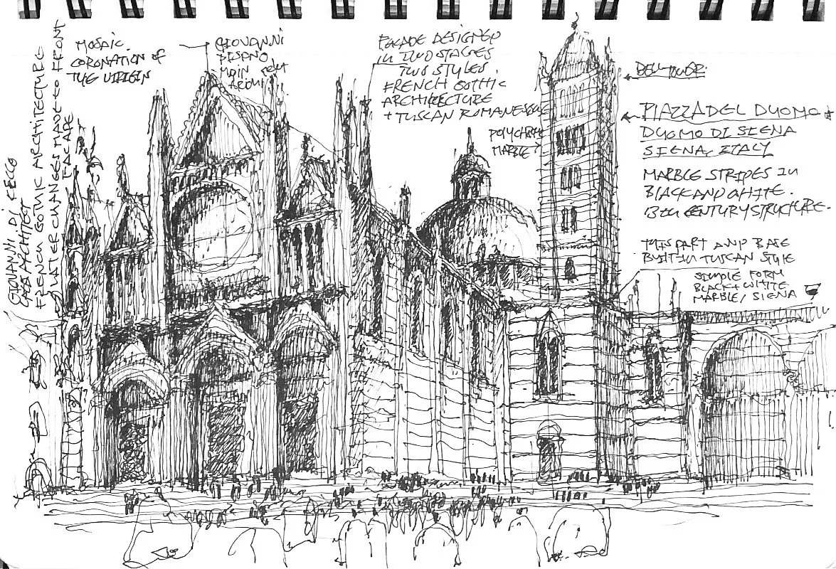
It wasn't as dramatic as I had imagined, but the cathedral itself had an absolutely incredible and intricately detailed facade, reminiscent of Indian temples. However, it also had some peculiar features. The front facade was highly decorated, while the other parts had a more defined architecture with black and white marble stones. These differences raised another question that I needed to investigate further. I rested on a beautiful shaded corner in front of the Duomo di Siena, doing another sketch and enjoying the scene.
Duomo di Siena was an ambitious project by the church. The original plans were by Giovanni di Agostino, continued by the work of Giovanni Pisano and Giovanni di Cecco. The alterations were executed by different architects, sculptors, and artists, each with their own visions and directions.
The work incorporated various architectural styles, ranging from French Gothic architecture to Tuscan Romanesque. The upper portion of the facade was heavily decorated in French Gothic style, while the Romanesque elements feature simple, rounded structures and tall, pill-like towers. On the other hand, Gothic architecture showcases ornate decorations, pointed arches, flying buttresses, and an emphasis on verticality and height. The construction was heavily affected by the spread of the black death in 1348.
What we see now in Duomo di Siena is the accumulation of years of construction, extension, alterations, and adjustments.
Strolling Through
I took several walks in the narrow streets of the city and around the piazza, capturing photos and enjoying lunch at a traditional steakhouse in Siena. It was a great way to conclude my visit to this beautiful city. For more photography, you can find the Gallery section of Siena here. check out the photography Album of Siena here.
“These relationships demonstrate a dynamic equilibrium between form and content, one of the prerequisite conditions for placemaking in an urban setting.”
Conclusion
I have to admit that this blog post falls short of adequately capturing the greatness of such remarkable architecture and urban qualities. It serves merely as a means to explore and document ideas and observations.
However, it is important to recognize that this architecture is truly timeless, as it engages deeply with our perception, social and cultural context, physical relationships to space, and the correlation between religious and civic authority.
Achieving this level of spatial intelligence required extensive thought and time. It transcends any particular era; it belongs to humanity as a whole. In today's architectural practice, we often struggle to attain this level of understanding due to our fast-paced nature and lack of time to appreciate the gradual progression achieved by many architects, craftsmen, and artists building upon one another's work.
Contemporary architecture tends to prioritize individual vision and design trends. Nonetheless, this architecture will endure for centuries as a testament to enduring qualities that transcend time.
References
en.wikipedia.org/wiki/Republic_of_Siena
Form and Content: The Analysis of an Urban Setting David Walters
Lecture 10: The Uses of Decorum, Dr. Richard Ingersoll, Rice University
en.wikipedia.org/wiki/Piazza_del_Campo
https://www.architects.nsw.gov.au/download/BHTS/Embracing-The-Square_Duncan_Corrigall.pdf


