Thoughts on Pinakothek der Moderne and Ronchamp
Recently, I began to believe that the places I visit and experience deeply influence my perspective and practice in architecture. I always recall those moments whenever I work on a new project or competition intuitively. I know that they have a great impact that why I thought I should revisit the pictures and sketches I've captured, seeking to recreate the scenes and emotions of those moments.
While writing those words, I retain a vivid memory of an art museum in Munich, yet with each return visit, I discover something new, finding each experience both surprising and compelling.
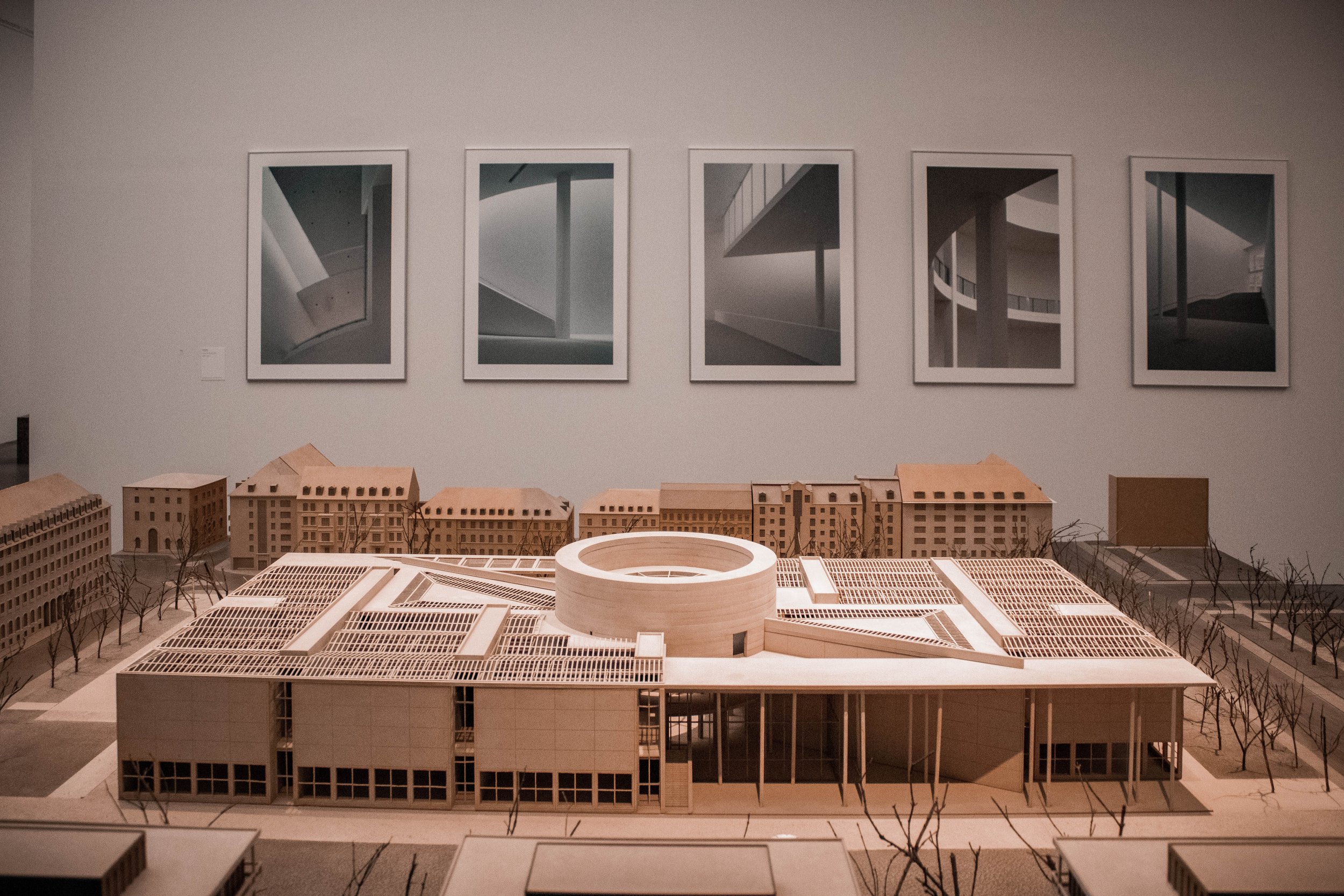
This Memory is particularly relevant to the Pinakothek der Moderne in Munich. At first glance, the building may not appear remarkable, but in my opinion, it embodies a mastery of how architecture can significantly contribute to the cityscape and its urban fabric, especially in a conservative city like Munich. The museum's interior is characterized by genuine white spaces, abundant natural light, and easy navigation throughout the building. Its plan features a rectangular shape intersected by a central circle, bisected by a diagonal axis that creates an interruption in the outer facade.
This interruption forms a welcoming entry point to the museum, and it's what I find most captivating about the building. It's remarkable how a small, well-crafted space on the edge between the city's urban fabric and the building can foster life. This space, invisible yet defined by the building's edges on one side and open to the city on the other, serves as a genuine invitation to explore the museum's modern art and architecture. Stephan Braunfels' ingenuity lies in creating this space—a subtle cut in the building that opens it to the city, allowing people to utilize it in various ways, depending on how they define it. It's a truly genuine public space embraced by the museum's walls.
During each visit, I've observed people using the space in different ways. Once, I witnessed individuals singing with loudspeakers, while others engaged in sports or participated in large art festivals. Following the building's outer skin, one might initially find it unremarkable, with its seemingly mundane concrete walls. However, this perception changes upon encountering the interruption in the regularity of the walls, transforming into a lively, livable urban space filled with people engaging in various activities.
Recently, I had the opportunity to visit the Ronchamp Chapel and personally experience Le Corbusier's architectural mastery in creating the outdoor chapel. It's an incredibly beautiful space, subtly blending with its natural surroundings. I recall sketching from this outdoor space and labeling it "the cave" because I felt completely immersed in its openness. It exemplifies the mastery of making subtle and natural cuts in a building and offering it to the public, whether in a city, as in Pinakothek der Moderne, or within a sacred landscape, as seen in the case of Ronchamp. Both architectures are great examples of how they created an invisible outdoor room in the city for people to encounter and interact with.
The Cave


